From Detailed Logo to Readable Small Patch: An Artwork Adjustment Example
Illustrative example: The artwork and production decisions below show how a manufacturer might review a small embroidered patch. They do not describe a named customer order or an approved production sample.
A detailed logo can look excellent on a screen and lose its message when reduced to a small embroidered patch. The usual trouble spots are thin outlines, crowded lettering and fine illustration details competing for a limited stitching area. The solution is to decide what the patch must communicate first, then adapt the artwork around that priority.
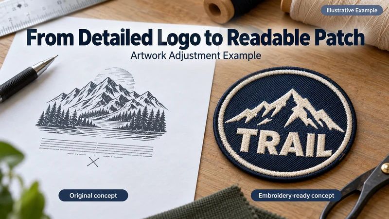
Consider an outdoor apparel brand planning a compact round patch for a cap or jacket chest. Its original logo contains mountains, a tree line, water, the main word TRAIL and a small secondary phrase. The full illustration works well on a website. At patch size, all those elements are asking the thread for space at once.
Here is how we would review that brief before promising a bulk result.
The Original Artwork and Target Size
The buyer wants the patch to remain compact enough for apparel placement. The brand name must be readable; the mountain scene should still feel recognizably outdoors. The secondary phrase is desirable, but less important than those two features.
That priority order belongs in the brief. Without it, an artwork team might carefully preserve every tree and quietly make the brand name too small.
The production review would start with three files or views:
- The original logo at full resolution.
- A layout at the proposed finished patch dimensions, including its border.
- A photograph or placement guide for the intended cap or garment.
We would also confirm the backing and edge finish. A prominent border occupies visual space, while the patch’s placement limits how large the overall design can become. Neither decision should wait until the logo has already been squeezed into the middle.
Which Details Become Hard to Recognize When the Logo Shrinks?
At finished size, the designer should stop zooming in and look at the patch as a customer would. In this example, the review is likely to flag four issues.
The secondary phrase becomes too small. Thin letter strokes and tight spacing can close up when converted to stitches. It may look like a textured line rather than readable words.
Individual trees merge together. A row of fine trunks and branches can become a dark band. The viewer understands “forest” from a simpler silhouette; stitching every branch may add work without adding clarity.
Mountain contour lines compete with the name. Fine shaded lines make the original illustration rich, but too many lines near the lettering reduce contrast where it matters most.
The border crowds the artwork. If the design fills the entire digital circle, adding the finished edge leaves little room around the name or landscape.
These are risks to test, not a claim that a physical sample has already failed. The actual result depends on artwork, dimensions, thread, base material and digitizing.
What Artwork Changes Would We Propose?
The goal is to keep the design’s identity while making it readable in thread. We would prepare an embroidery-focused version of the logo alongside the original, then ask the buyer to approve the changes before sampling.
| Original detail | Proposed adjustment | Reason |
|---|---|---|
| Fine secondary phrase | Remove it from the patch or place it on packaging | Protect the legibility of the main name |
| Many small trees | Use a few clearer tree silhouettes | Preserve the outdoor setting without a crowded dark area |
| Multiple thin mountain lines | Keep the strongest peaks and major light/dark areas | Make the mountain readable at normal viewing distance |
| Narrow TRAIL lettering | Use a bolder treatment with more open spacing | Keep individual letters distinct when stitched |
| Artwork close to the border | Add clear space inside the finished edge | Prevent the rim from pressing against the design |
This is a proposed design direction, not permission to alter a customer’s logo without approval. Some brands cannot remove a tagline or change a letterform. In that case, the buyer and manufacturer should compare a larger patch, a woven construction or another suitable process before proceeding.
What Would the Buyer Approve Before Sampling?
The revised digital proof should show the original and adapted versions side by side at the same finished size. It should identify every intentional change rather than presenting the new design as though it were an exact reproduction of the supplied file.
The buyer would check:
- Is TRAIL the first element people notice?
- Is the mountain still recognizable as the brand’s intended icon?
- Has any protected part of the logo changed?
- Has the small phrase been removed, relocated or retained with approval?
- Are the finished dimensions, border, colors and backing correct?
Only after those questions are settled does a stitched sample become an effective test. Otherwise, the sample may prove that the machine followed a design the buyer never meant to approve.
What Should the Physical Sample Prove?
A digital proof can show proportions. A physical sample shows what the thread actually did.
At the sample stage, place the patch on the intended hat or garment and inspect it at ordinary viewing distance. Read the main word without referring to the artwork file. Check whether the openings in the letters remain clear, whether the mountain shape survives, and whether the edge leaves enough space around both.
Then inspect the construction close up: border consistency, thread coverage, color appearance, backing and the way the patch sits on the fabric. If the brand name is still crowded, record a specific change—such as increasing letter spacing or reducing nearby details—and request an updated approval path. Do not label the sample “approved” merely because it looks attractive in a close-up photo.
The intended outcome is a readable, brand-appropriate patch. Whether this particular illustrated design achieves that outcome can only be established by making and reviewing its real sample.
What Can a Buyer Take From This Example?
When adapting any detailed logo to a small patch, send more than the artwork file. Tell the manufacturer the finished size, placement and which elements cannot be changed. Rank the remaining elements by importance.
If the first proof looks crowded, ask for a side-by-side proposal: the original layout and an adjusted embroidery version, both shown at actual size. That makes the trade-off visible. The team can choose to simplify, increase the patch size or change construction before ordering bulk goods.
The broader lesson is straightforward: a small patch has to communicate quickly. The best artwork adjustment preserves what customers recognize, even if it leaves behind details they would only see at 400% zoom.
For other patch planning topics, browse the Knowledge guides.
FAQ
Does simplifying a logo mean changing the brand?
It does not have to. The purpose is to preserve the essential name, shape and color relationships in a different physical format. The brand owner should approve every proposed adjustment.
Can we keep the small phrase by using finer thread?
Finer thread may help some details, but it cannot guarantee readable lettering at every size. Review the actual phrase, spacing and proposed construction in a physical sample.
Would a woven patch solve the problem?
It may reproduce finer detail and smaller text more clearly, but it has a flatter appearance than embroidery. Compare both samples if raised stitching is important to the brand.
Should we approve the enlarged mockup?
Use the enlarged view to check construction details, then also view the proof at actual finished size. An enlarged image can hide a readability problem.
What if the secondary phrase is legally or contractually required?
Tell the manufacturer that it cannot be removed. The team may need a larger patch, a different layout or another production method. Do not omit required wording without the buyer’s approval.
What should be retained for a reorder?
Keep the approved artwork version, finished dimensions, color references, construction details and physical sample. Refer to those records when requesting another run.
Start With the Message the Patch Must Carry
A detailed logo does not need every original line to work as a patch. It needs the right details at the right finished size, approved by the brand and confirmed in a sample. That is the point of artwork review: making design decisions while they are still easy to change.
To review your own logo, send the artwork, target dimensions and intended placement. Mark the text and design elements that must remain unchanged, and request a finished-size proof before sampling.