How to Plan a Multi-Design Patch Collection Without Losing Color Consistency
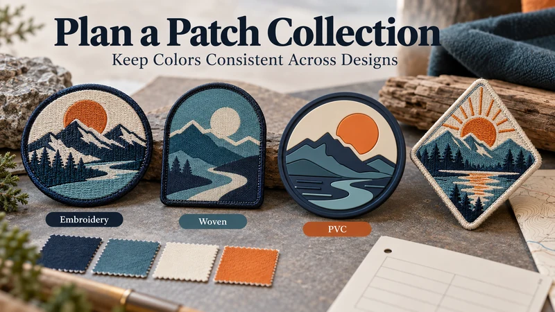
A coordinated patch collection needs one shared specification and a separate approved sample for each design and material. Start by defining the brand colors, sizes, edge and backing rules that should carry across the range. Then check those colors on the actual embroidered, woven or PVC samples before approving bulk production.
This matters when a clothing brand launches several jacket patches, cap badges and bag accessories at once. Each piece may look convincing on its own. Put them together on a retail display, and a warmer orange thread beside a cooler orange PVC surface can suddenly become the first thing everyone notices.
The goal is a collection that looks intentionally related—not an unsupported promise that different materials will appear physically identical.
Which Specifications Should Every SKU Share?
Before drawing every variation, decide what makes the products a collection. Record the rules that should stay consistent even when the artwork changes.
| Shared decision | What to define |
|---|---|
| Brand palette | Color references and which colors are essential |
| Logo treatment | Minimum clear space, orientation and approved versions |
| Size system | Finished dimensions for each product placement |
| Edge language | Merrowed, cut or other approved finish by design |
| Backing | What each patch must attach to and the specified backing |
| Artwork files | One approved file and version for each SKU |
| Packaging | Label position, SKU identification and packing method |
“Consistent” does not mean every patch must be the same shape or size. A cap patch and a jacket-back patch serve different placements. They can still share a recognizable palette, logo proportions and finish rules.
If the collection mixes patch types, identify each one in the range plan. Embroidered, woven and PVC should not be treated as interchangeable line items simply because the digital artwork uses the same colors.
Why Is a Pantone Reference Only the Start of Color Approval?
A Pantone reference gives the buyer and manufacturer a more specific color target than “dark blue” or “the orange in our JPEG.” Include the complete color reference and relevant system, and provide a physical reference when the color is central to the brand.
The reference does not replace a production sample. Thread has texture and reflects light differently from a molded PVC surface. A woven area may also look different from a raised embroidered area, even when both are selected to represent the same brand color. Screen brightness and photographs introduce another layer of variation.
For a practical approval process:
- Send the brand’s color references with the artwork.
- Ask the manufacturer what material or thread options are available for each patch type.