How Small Can Text Be on an Embroidered Patch?
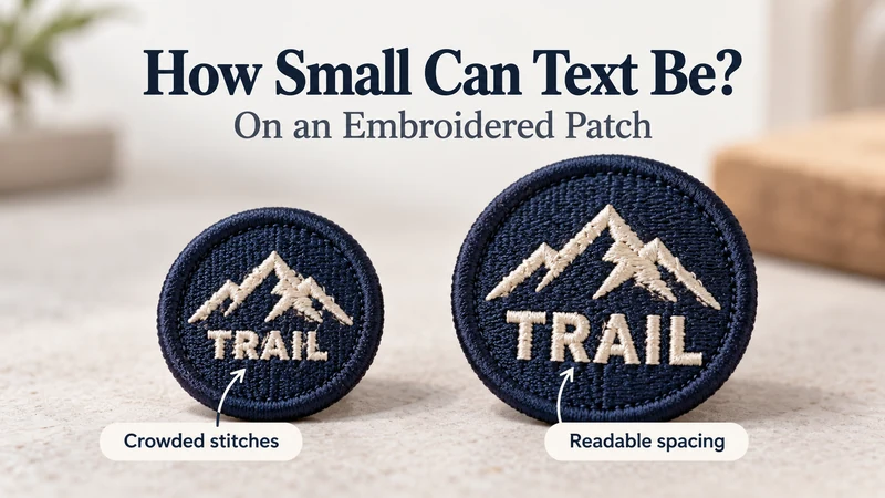
Small text on an embroidered patch must be large enough for the individual letters and their open spaces to survive stitching. There is no single minimum letter height that works for every font, patch and thread. A short, bold word may remain readable where a thin slogan at the same height turns into a line of thread.
If your logo contains a tagline, location, department name or small curved lettering, ask the manufacturer to evaluate it at the finished patch size. A zoomed-in artwork file is useful for reviewing the design, but it cannot tell you exactly how the sewn letters will look in someone’s hand.
Why Can Text Look Clear on Screen but Run Together When Stitched?
A screen can display very fine lines and tiny gaps. Embroidery has to build each letter from physical stitches laid on fabric. When the lettering becomes too small, thread can fill the open center of an a, e or o. Spaces between neighboring letters may also become less distinct.
Digitizing—the process of planning how the artwork will stitch—matters as much as the image file. A small word cannot always be made successfully by shrinking a stitch file designed for larger lettering. Stitch direction, spacing, underlay and the number of stitches all need to suit the final size.
The patch base matters too. If the material shifts while stitching, a tiny letter has less room for error than a large one. Add a curved text path or a heavy embroidered background, and the available space gets tighter still.
That is why “the PDF looks sharp” and “the sample reads clearly” are two different approvals.
How Do Font Weight, Letter Spacing and Stitches Affect Readability?
Font weight: Very thin strokes may not form a clear embroidered letter. Thick strokes can also become a problem when they crowd the small spaces inside and between letters. A simple, reasonably bold typeface is often a better starting point than delicate script or a font with fine serifs.
Letter spacing: Closely set letters may touch once stitched, even if they look separate on screen. Pay special attention to combinations such as rn, ll and cl, where the identity of each letter depends on a visible gap.
Letter shape: The open areas inside a, e, o, p and R need enough space to remain visible. A buyer should inspect these letters in the sample, rather than judging a word only by its overall length.
Stitch construction: The way a letter is digitized changes its finished appearance. Fine embroidery thread can help with detail in some applications, but it is not a promise that any font can be made arbitrarily small. The artwork, material and production settings still have to work together.
Background contrast: Cream letters on a navy patch are usually easier to assess than two similar colors. Strong contrast cannot fix merged stitches, but weak contrast can make otherwise acceptable lettering harder to read.
What Can You Do If the Text Is Too Small?
There are three practical options. Choose according to what your brand must preserve.
1. Shorten or simplify the wording
Remove words that do not need to appear on the patch. Keep the brand name or essential identification on the patch and place the longer message on a garment label, hangtag or packaging card.
If the wording must stay, try a simpler typeface, more space between letters or a straight line instead of a tight curve. Ask for a revised proof at actual size.
2. Make the patch or lettering larger
A slightly larger patch may give the text room without changing the brand message. Check the placement first: a size that works on a jacket sleeve may be too large for a hat panel.
You can also rebalance the artwork. Reduce an oversized icon, move the text away from a thick border or give the lettering a dedicated area. Increasing the letters themselves is more useful than enlarging the patch while leaving the text at its original size.
3. Consider a woven patch
If fine text is essential and the finished patch size cannot increase, ask whether a woven patch would reproduce the artwork more clearly. Woven construction can be better suited to finer lettering and detail, with a flatter appearance than raised embroidery.
This changes the product’s look and feel. Request samples of both methods if the stitched texture is important to the brand. If the design contains very fine gradients or photographic details as well as text, discuss a suitable printed option too.
| Your priority | First option to explore |
|---|---|
| Raised stitched texture and a short, bold name | Embroidered patch |
| Same embroidered look, but text is crowded | Simplify text or increase letter size |
| Small patch with essential fine lettering | Woven patch |
| Detailed image, gradients and extensive small copy | Ask about an appropriate printed construction |
How Should You Test Readability Before Production?
Send the manufacturer the artwork along with the finished patch width and height, intended placement and the exact text that must remain legible. Mark that text as a priority. Do not let an optional tagline receive the same production priority as the brand name without saying so.
Then use this approval sequence:
- View the digital proof at actual size. Avoid approving lettering only while zoomed in. Check the border and backing specifications at the same time.
- Ask which details were changed for production. Were letters thickened, gaps opened or words repositioned? Approve those changes rather than assuming the original artwork will be reproduced pixel for pixel.
- Review a physical sample when readability is critical. Read it at a normal viewing distance and inspect close-ups of difficult letters.
- Compare the sample with the intended placement. Put a hat patch against the hat panel or a sleeve patch against the sleeve.
- Record the approved version. Keep the proof, sample photo and dimensions together for bulk inspection and future reorders.
If you are deciding between two sizes, ask for the same design in both sizes. That comparison tells you much more than a generic claim that a particular font height “should work.”
For more buying and production topics, browse the Knowledge guides.
What Should a Buyer Check on the Sample?
Do not stop at “I can read the company name.” Look at the parts most likely to fail:
- Are the centers of a, e and o still open?
- Are neighboring letters clearly separate?
- Are punctuation and numbers recognizable?
- Does curved text stay even around the design?
- Is there enough space between the text and the border?
- Does the wording read at normal distance on the intended garment?
- Do the pieces reviewed for the bulk order match the approved sample?
If a letter is only recognizable because you already know what it is supposed to say, revise the design. Your customer will not have the artwork file beside them as a hint.
FAQ
What is the minimum font size for an embroidered patch?
There is no universal answer. A workable size depends on the font, letter spacing, thread, patch material, digitizing and finished dimensions. Ask the manufacturer to review and sample your exact artwork.
Can a manufacturer simply use thinner thread?
Finer thread may improve definition for some designs, but it does not remove the need for adequate letter shapes and spacing. Confirm the result in a sample.
Are capital letters always easier to embroider?
Not always. Simple capitals can be useful for short names, but a long line of tightly packed capitals can still be difficult to read. Judge the complete word at its final size.
Can I keep my script font on a small patch?
Possibly, if the lettering is large and open enough. Very fine connections and tight loops are difficult at small sizes. Ask to compare your script with a simplified alternative before approval.
Does a bigger patch automatically fix small text?
Only if the lettering is enlarged or given more space as part of the revised layout. A bigger patch with the same tiny text does not solve the underlying problem.
Is woven always better than embroidered for text?
No. Woven patches are useful when fine detail is the priority. Embroidery gives a different, raised texture and can work well for appropriately sized lettering. Choose according to the actual artwork and desired finish.
Should I approve a digital mockup without a physical sample?
A digital proof is useful for confirming spelling, layout and specifications. If small-text readability is a critical requirement for a bulk order, a physical sample gives you stronger evidence of the finished result.
Let the Finished Patch Make the Decision
The best question to ask is not “What is the smallest font your factory can make?” Ask: “At this finished size, will a new customer read our actual wording clearly?”
Send the artwork, intended patch dimensions,